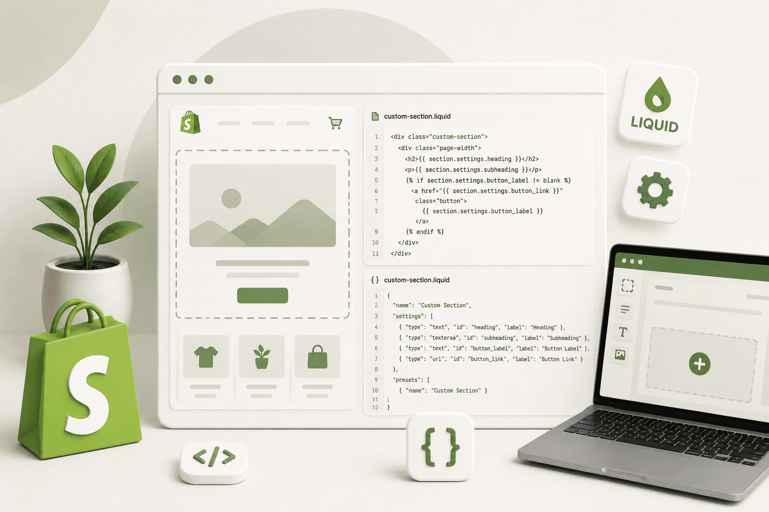
One of the most useful skills in Shopify theme development is learning how to create your own custom sections.
Shopify themes already provide many built-in sections, but real projects often require custom layouts and functionality that aren't available in the default theme.
This is where Liquid and Shopify section schema become especially useful.
In this tutorial, we'll build a complete custom Shopify section from scratch. You'll learn how to create the Liquid file, add schema settings, display dynamic content, add an image picker, create a configurable button, make the section responsive, and add reusable blocks.
By the end, you'll understand not only how to create one section, but also how to approach custom section development in real Shopify projects.
Why Shopify Store Speed Matters
What Is a Shopify Custom Section?A Shopify section is a reusable theme component that can contain Liquid, HTML, CSS, JavaScript, settings, and blocks.
A custom section allows you to create a component that store owners can configure through the Shopify theme editor instead of requiring them to edit Liquid code every time they want to change content.
For example, you might create custom sections for:
- Hero banners
- Image-with-text layouts
- Testimonials
- Feature lists
- Promotional banners
- FAQ sections
- Custom product grids
- Brand logos
- Call-to-action sections
- Custom content blocks
Why Shopify Store Speed Matters
What Is Shopify Section Schema?A section's schema defines how the section can be configured in Shopify's theme editor.
Schema can define settings such as:
- Text
- Rich text
- Images
- Colors
- Links
- Checkboxes
- Dropdowns
- Ranges
- Product selection
- Collection selection
- Blocks
For example, instead of hard-coding a heading:
<h2>Welcome to Our Store</h2>you can create a setting:
{% raw %}{
    "type": "text",
    "id": "heading",
    "label": "Heading"
}{% endraw %}
and then output it using:
{% raw %}{{ section.settings.heading }}{% endraw %}This makes the content editable from the Shopify theme editor.
Why Shopify Store Speed Matters
What We're Going to BuildFor this tutorial, we'll create a responsive image and content section.
It will include:
- Section heading
- Description
- Image picker
- Button text
- Button link
- Text alignment
- Color settings
- Desktop/mobile layout
- Optional content blocks
The final structure will look approximately like:
Custom Section
│
├── Image
│
└── Content
    ├── Heading
    ├── Description
    └── Button
Why Shopify Store Speed Matters
Step 1: Create the Section File
Shopify custom sections are normally created inside the
sections directory.
Create a new file such as:
sections/custom-image-content.liquidThe filename can be different, but use a clear name that describes what the section does.
Why Shopify Store Speed Matters
Step 2: Create the Basic HTML StructureStart with a simple section wrapper:
{% raw %}


{% endraw %}
Notice that we're using component-specific class names instead of
generic classes such as .container or
.content.
This is especially useful when working on an existing Shopify theme where other sections may already use similar class names.
Why Shopify Store Speed Matters
Step 3: Add a Dynamic HeadingInstead of hard-coding the heading, we'll create a section setting.
First, add the schema at the bottom of the section:
{% raw %}{% schema %}
{
    "name": "Custom Image Content",
    "settings": [
        {
            "type": "text",
            "id": "heading",
            "label": "Heading",
            "default": "Build a better shopping experience"
        }
    ],
    "presets": [
        {
            "name": "Custom Image Content"
        }
    ]
}
{% endschema %}{% endraw %}
Now you can access the setting inside the section:
{% raw %}Why Shopify Store Speed Matters
    {{ section.settings.heading }}
{% endraw %}
The important relationship is:
Schema Setting
      ↓
section.settings.heading
      ↓
HTML Output
Why Shopify Store Speed Matters
Step 4: Add a Description SettingWe can add another setting for the section description.
{% raw %}{
    "type": "textarea",
    "id": "description",
    "label": "Description",
    "default": "Create flexible Shopify storefronts with reusable theme components."
}{% endraw %}
Then display it:
{% raw %}{% if section.settings.description != blank %}

        {{ section.settings.description }}

{% endif %}{% endraw %}
Checking for blank is useful because the merchant may
choose not to provide a description.
Why Shopify Store Speed Matters
Step 5: Add an Image Picker
Shopify's image_picker setting allows the merchant to
select an image through the theme editor.
{% raw %}{
    "type": "image_picker",
    "id": "image",
    "label": "Image"
}{% endraw %}
You can then render the selected image:
{% raw %}{% if section.settings.image != blank %}
    {{
        section.settings.image
        | image_url: width: 1200
        | image_tag:
            loading: 'lazy',
            class: 'custom-image-content__image'
    }}
{% endif %}{% endraw %}
This is preferable to hard-coding an image URL because the store owner can change the image directly from the theme editor.
Why Shopify Store Speed Matters
Step 6: Add Button SettingsLet's make the button editable as well.
Add two settings:
{% raw %}{
    "type": "text",
    "id": "button_label",
    "label": "Button label",
    "default": "Explore Collection"
},
{
    "type": "url",
    "id": "button_link",
    "label": "Button link"
}{% endraw %}
Then render the button:
{% raw %}{% if section.settings.button_label != blank %}


        {{ section.settings.button_label | escape }}


{% endif %}{% endraw %}
You can also check that the link exists before rendering it:
{% raw %}{% if section.settings.button_label != blank
    and section.settings.button_link != blank %}


        {{ section.settings.button_label | escape }}


{% endif %}{% endraw %}
Why Shopify Store Speed Matters
Step 7: Add a Text Alignment Setting
Shopify schema can provide selectable options through a
select setting.
{% raw %}{
    "type": "select",
    "id": "text_alignment",
    "label": "Text alignment",
    "options": [
        {
            "value": "left",
            "label": "Left"
        },
        {
            "value": "center",
            "label": "Center"
        },
        {
            "value": "right",
            "label": "Right"
        }
    ],
    "default": "left"
}{% endraw %}
You can then add the selected value to your class:
{% raw %}{% endraw %}
Your CSS can then control each alignment:
.custom-image-content__content--left {
text-align: left;
}
.custom-image-content__content--center {
text-align: center;
}
.custom-image-content__content--right {
text-align: right;
}
Why Shopify Store Speed Matters
Step 8: Add Color Settings
Shopify also supports color settings.
For example:
{% raw %}{
"type": "color",
"id": "background_color",
"label": "Background color",
"default": "#f5f5f5"
}{% endraw %}
You can use the selected color in the section:
{% raw %}{% endraw %}
For larger production projects, you may prefer CSS custom properties
or theme-level variables instead of placing many inline styles.
Why Shopify Store Speed Matters
Step 9: Add Responsive CSS
A custom Shopify section should not be considered finished just
because it works on desktop.
Your section should also work on mobile devices.
A basic responsive layout could use CSS Grid:
.custom-image-content__container {
max-width: 1200px;
margin: 0 auto;
padding: 60px 24px;
display: grid;
grid-template-columns: 1fr 1fr;
gap: 48px;
align-items: center;
}
.custom-image-content__image {
width: 100%;
height: auto;
display: block;
}
@media screen and (max-width: 749px) {
.custom-image-content__container {
grid-template-columns: 1fr;
gap: 28px;
padding: 40px 20px;
}
}
On desktop, the image and content appear next to each other.
On smaller screens, they stack vertically.
Why Shopify Store Speed Matters
Step 10: Add Mobile-Specific Controls
Sometimes a merchant needs different spacing or layout behavior on
mobile.
You can expose additional settings where appropriate, but don't
create a setting for every CSS property.
A good section should provide useful design controls without
overwhelming the merchant with dozens of settings.
Why Shopify Store Speed Matters
Step 11: Add Blocks to the Section
Now let's make the section more flexible by adding blocks.
Imagine that the content area should support multiple features:
Custom Image Content
│
├── Heading
├── Description
├── Feature Block
├── Feature Block
└── Button
Define a block in the schema:
{% raw %}"blocks": [
{
"type": "feature",
"name": "Feature",
"settings": [
{
"type": "text",
"id": "title",
"label": "Title"
},
{
"type": "textarea",
"id": "text",
"label": "Description"
}
]
}
]{% endraw %}
Then loop through the blocks:
{% raw %}{% for block in section.blocks %}
{{ block.settings.title | escape }}
{% if block.settings.text != blank %}
{{ block.settings.text }}
{% endif %}
{% endfor %}{% endraw %}
The block.shopify_attributes attribute is important
when working with blocks in the Shopify theme editor because it
helps Shopify identify the block within the editor.
Why Shopify Store Speed Matters
Step 12: Add Block Limits
You can control how many blocks the merchant can add.
{% raw %}"limit": 4{% endraw %}
For example:
{% raw %}"blocks": [
{
"type": "feature",
"name": "Feature",
"limit": 4,
"settings": [
{
"type": "text",
"id": "title",
"label": "Title"
}
]
}
]{% endraw %}
Use limits when the design has a practical maximum. For example,
allowing 20 feature cards might create a poor user experience even
if the Liquid code technically supports it.
Why Shopify Store Speed Matters
Step 13: Add a Preset
A preset allows the section to be added to the theme editor with a
predefined configuration.
{% raw %}"presets": [
{
"name": "Custom Image Content"
}
]{% endraw %}
Without a useful preset, the merchant may not see the section in
the same convenient way when adding sections through the theme
editor.
Why Shopify Store Speed Matters
Complete Custom Section Example
Now let's put the main concepts together.
The following example creates a responsive image-and-content
section with heading, description, image, button, alignment, and
feature blocks.
{% raw %}
{% if section.settings.image != blank %}
{{
section.settings.image
| image_url: width: 1200
| image_tag:
loading: 'lazy',
class: 'custom-image-content__image'
}}
{% endif %}
{% if section.settings.heading != blank %}
Why Shopify Store Speed Matters
{{ section.settings.heading | escape }}
{% endif %}
{% if section.settings.description != blank %}
{{ section.settings.description }}
{% endif %}
{% if section.blocks.size > 0 %}
{% for block in section.blocks %}
{% if block.settings.title != blank %}
{{ block.settings.title | escape }}
{% endif %}
{% if block.settings.text != blank %}
{{ block.settings.text }}
{% endif %}
{% endfor %}
{% endif %}
{% if section.settings.button_label != blank
and section.settings.button_link != blank %}
{{ section.settings.button_label | escape }}
{% endif %}
{% schema %}
{
"name": "Custom Image Content",
"settings": [
{
"type": "image_picker",
"id": "image",
"label": "Image"
},
{
"type": "text",
"id": "heading",
"label": "Heading",
"default": "Build a better shopping experience"
},
{
"type": "textarea",
"id": "description",
"label": "Description",
"default": "Create flexible Shopify storefronts with reusable theme components."
},
{
"type": "text",
"id": "button_label",
"label": "Button label",
"default": "Explore Collection"
},
{
"type": "url",
"id": "button_link",
"label": "Button link"
},
{
"type": "select",
"id": "text_alignment",
"label": "Text alignment",
"options": [
{
"value": "left",
"label": "Left"
},
{
"value": "center",
"label": "Center"
},
{
"value": "right",
"label": "Right"
}
],
"default": "left"
},
{
"type": "color",
"id": "background_color",
"label": "Background color",
"default": "#f5f5f5"
}
],
"blocks": [
{
"type": "feature",
"name": "Feature",
"limit": 4,
"settings": [
{
"type": "text",
"id": "title",
"label": "Title"
},
{
"type": "textarea",
"id": "text",
"label": "Description"
}
]
}
],
"presets": [
{
"name": "Custom Image Content"
}
]
}
{% endschema %}{% endraw %}
Why Shopify Store Speed Matters
Step 14: Add the CSS
You can keep the styling in a dedicated CSS file instead of
placing a large style block directly inside the section.
.custom-image-content {
width: 100%;
}
.custom-image-content__container {
max-width: 1200px;
margin: 0 auto;
padding: 64px 24px;
display: grid;
grid-template-columns: minmax(0, 1fr) minmax(0, 1fr);
gap: 48px;
align-items: center;
}
.custom-image-content__media {
width: 100%;
}
.custom-image-content__image {
width: 100%;
height: auto;
display: block;
border-radius: 12px;
}
.custom-image-content__content {
width: 100%;
}
.custom-image-content__content--left {
text-align: left;
}
.custom-image-content__content--center {
text-align: center;
}
.custom-image-content__content--right {
text-align: right;
}
.custom-image-content__description {
margin-top: 16px;
}
.custom-image-content__features {
display: grid;
gap: 16px;
margin-top: 24px;
}
.custom-image-content__feature {
padding: 16px;
}
.custom-image-content__button {
display: inline-block;
margin-top: 28px;
padding: 14px 24px;
text-decoration: none;
}
@media screen and (max-width: 749px) {
.custom-image-content__container {
grid-template-columns: 1fr;
gap: 28px;
padding: 40px 20px;
}
.custom-image-content__content--left,
.custom-image-content__content--center,
.custom-image-content__content--right {
text-align: left;
}
.custom-image-content__button {
width: 100%;
text-align: center;
}
}
The exact design can obviously be adapted to match the theme. The
important part is that the section remains responsive and doesn't
depend on fixed desktop dimensions.
Why Shopify Store Speed Matters
How to Add the Custom Section to a Shopify Theme
After creating and saving the section, open the Shopify theme
editor.
Navigate to the page where you want to use the section and choose
Add section.
Your section should appear using the name defined in the schema:
"name": "Custom Image Content"
After adding it, the settings you defined in the schema should be
available in the theme editor.
Why Shopify Store Speed Matters
Why Use Schema Instead of Hard-Coded Content?
Hard-coded content can be acceptable for certain developer-only
functionality, but most merchant-facing sections should expose
appropriate settings.
Compare:
<h2>Summer Collection</h2>
with:
{% raw %}{{ section.settings.heading }}{% endraw %}
The second approach allows the merchant to change the heading
without touching the theme code.
This is one of the biggest advantages of Shopify's theme editor.
Why Shopify Store Speed Matters
Common Shopify Section Development Mistakes
1. Forgetting the Schema
A section without a valid schema may not behave as expected in the
theme editor.
Always validate the schema structure and make sure the JSON is
properly formatted.
2. Using Duplicate IDs
Every setting inside a section should have an appropriate unique
id.
For example:
"id": "heading"
"id": "description"
"id": "image"
Avoid defining multiple settings with the same ID.
3. Forgetting to Check for Empty Values
Merchants don't always fill every setting.
Instead of blindly rendering an optional element:
{% raw %}{{ section.settings.button_label }}{% endraw %}
check whether the value exists:
{% raw %}{% if section.settings.button_label != blank %}
{{ section.settings.button_label }}
{% endif %}{% endraw %}
4. Making the Section Desktop-Only
A section should be tested on mobile devices before it is considered
complete.
Pay attention to:
- Image dimensions
- Text wrapping
- Button width
- Spacing
- Column stacking
- Font sizes
- Overflow
5. Using Generic CSS Classes
Classes such as .title, .container, or
.button can conflict with existing theme styles.
Use component-specific naming:
.custom-image-content__title
.custom-image-content__button
.custom-image-content__container
6. Putting Everything in One File
Small sections can be self-contained, but larger projects benefit
from separating reusable components into snippets and keeping CSS
and JavaScript organized.
Why Shopify Store Speed Matters
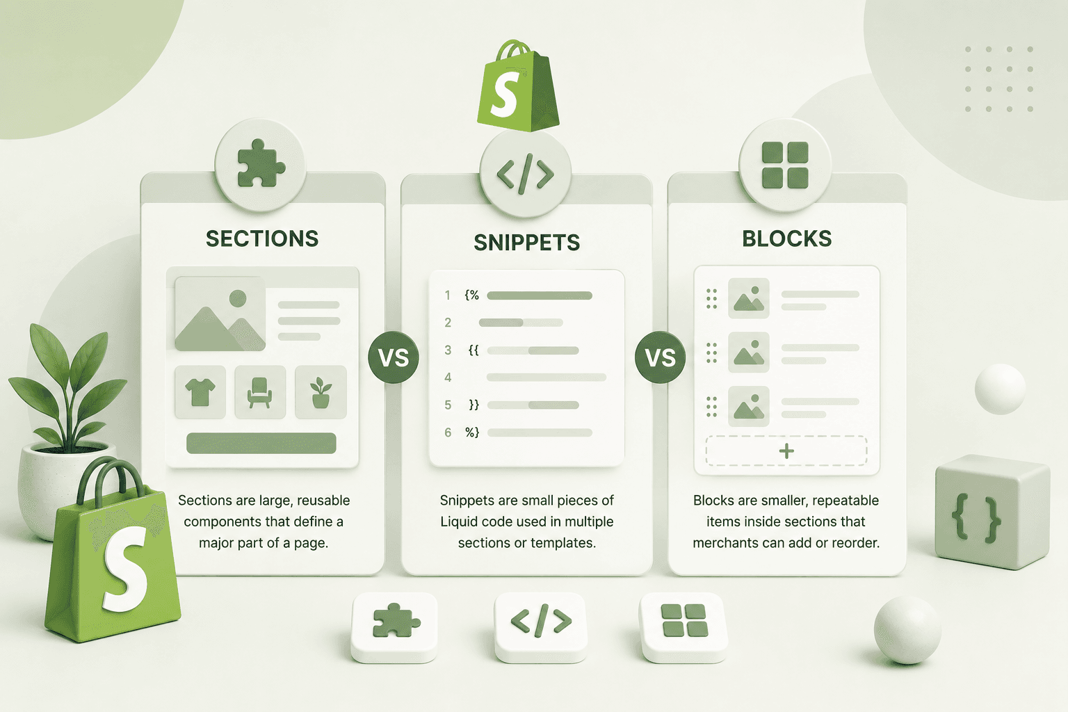
Section vs Snippet: Which Should You Use?
A section and a snippet serve different purposes.
Requirement
Use
Merchant-configurable page component
Section
Reusable small Liquid component
Snippet
Multiple configurable items
Blocks inside a section
Reusable product card
Snippet
Hero banner
Section
If you want a deeper explanation of this distinction, see our
guide on
Shopify Sections vs Snippets vs Blocks
.
Why Shopify Store Speed Matters
How to Make Custom Sections Easier to Maintain
Creating a section that works is only the first step. A professional
Shopify developer should also think about future maintenance.
Use Clear Naming
Give the section and its settings meaningful names.
Keep Schema Organized
Group related settings together instead of creating a long,
unstructured list.
Avoid Unnecessary Settings
Don't expose every possible CSS property as a theme setting.
Provide controls that are actually useful to the merchant.
Reuse Components
If the same markup appears in several sections, consider extracting
it into a snippet.
Test Multiple Screen Sizes
Test desktop, tablet, and mobile layouts before considering the
section complete.
Why Shopify Store Speed Matters
Performance Considerations
A custom section should also be developed with performance in mind.
Avoid adding unnecessary JavaScript libraries or loading assets that
aren't required by the section.
For images, use Shopify's image URL and image rendering capabilities
appropriately and avoid serving unnecessarily large images.
If a section contains JavaScript, consider whether that code needs
to run on every page or only when the section is actually present.
A flexible section shouldn't become a performance problem simply
because it contains too many features.
Why Shopify Store Speed Matters
SEO Considerations for Custom Shopify Sections
Custom sections can also affect SEO if they contain important
content.
Keep these points in mind:
-
Use semantic HTML where appropriate.
-
Use meaningful headings instead of styling random elements as
headings.
-
Provide useful image alt text.
-
Don't hide important content unnecessarily.
-
Make links descriptive and accessible.
-
Keep the section responsive and usable on mobile.
SEO should not mean filling every section with keywords. The goal is
to create useful content and a good experience while keeping the
markup understandable.
Why Shopify Store Speed Matters
Custom Section Development Workflow
A practical workflow for creating a custom Shopify section is:
- Define the design and functionality.
- Create the section file.
- Build the basic HTML structure.
- Add Liquid objects and dynamic content.
- Define schema settings.
- Add blocks if repeated content is required.
- Add responsive CSS.
- Add JavaScript only when necessary.
- Test the section in the theme editor.
- Test desktop and mobile layouts.
- Check accessibility and semantic HTML.
- Review performance before deployment.
Why Shopify Store Speed Matters
Frequently Asked Questions
What is a Shopify custom section?
A Shopify custom section is a reusable theme component created with
Liquid and a section schema. It can expose configurable settings and
blocks that merchants can manage through the Shopify theme editor.
Where do I create a Shopify section?
Shopify theme sections are created inside the theme's
sections directory. A section is usually a Liquid file
containing the component markup and its schema.
What is Shopify section schema?
Section schema defines the settings, blocks, presets, and other
configuration information used by Shopify's theme editor.
How do I make a Shopify section editable?
Add appropriate settings to the section schema and access those
values through objects such as
section.settings.heading.
Can a Shopify section have multiple blocks?
Yes. A section can define one or more block types in its schema and
loop through them using section.blocks.
How do I make a custom Shopify section responsive?
Use responsive CSS with flexible layouts such as CSS Grid or Flexbox,
appropriate image sizing, mobile breakpoints, and testing across
different screen sizes. Avoid fixed desktop-only dimensions.
Can I use JavaScript inside a Shopify section?
Yes. JavaScript can be used for interactive functionality such as
sliders, tabs, accordions, modals, and dynamic UI behavior. Keep
the JavaScript organized and avoid loading unnecessary code
globally.
Should CSS be inside the Shopify section file?
It can be for small, self-contained components, but larger Shopify
projects are generally easier to maintain when CSS is organized in
dedicated asset files or another consistent styling system.
Why Shopify Store Speed Matters
Final Thoughts
Creating a custom Shopify section is one of the most useful
skills you can learn as a Shopify theme developer.
The basic process is straightforward: create a section file, build
the Liquid and HTML structure, define the schema, connect settings
through section.settings, add blocks when necessary,
and make the component responsive.
The real challenge is creating sections that are not only functional
but also flexible, maintainable, accessible, performant, and easy
for a merchant to manage.
Avoid hard-coding content that the store owner will need to change.
Use schema settings for merchant-controlled values, blocks for
repeated configurable content, and snippets for reusable Liquid
components.
Once you become comfortable with this workflow, you can create
almost any custom Shopify component—from simple promotional banners
to complex product sections and fully customized storefront
experiences.
The best Shopify sections are not simply sections that look good.
They are components that make the store easier to manage while
keeping the underlying theme code clean and reliable.